I’ve chosen to analyze a quick setup guide for the card game Exploding Kittens. Personally, I feel that this is one of the best guides of its type as I’ve read many before, to which some have been lacking in clarity. The guide uses visuals and layout to its advantage in order to explain the game; and is very easy to navigate to specific parts which might have been forgotten mid-game.
Audience
- The document is included in the box, and the game is advertised for ages 7 and up. The documentation does not assume the player has any knowledge about how the game works.
Purpose
- The goal of the document is to enable players with game rules (types of cards, setup, win/lose scenarios)
Context
- The document is to be used in an informal setting, perhaps on a game night in a personal space such as a home. It will not be used during a time-sensitive situation. However, taking too long for the rules to be understood has risks for the user.
Cognates
Arrangement
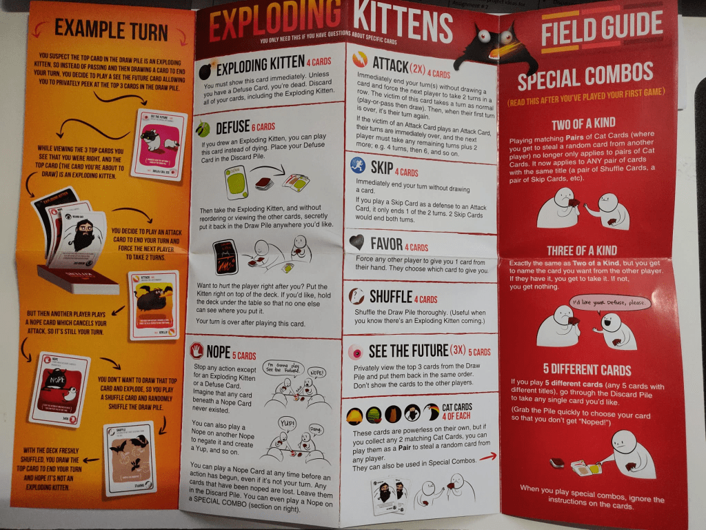
- The document is folded in a manner similar to a folding map. It is folded in half, and then opens “accordion” style with information on each side, including the back. Information is displayed in columns, separated by the folds of the document and follows a top-to-bottom style rather than from left to right. Where applicable, text is organized in numeric arrangement (ex. setup, rules).
Emphasis
- The largest headings are at the top of each column in bold and capitalized, which immediately lets the reader know what the panel will instruct (ex. HOW IT WORKS, BASICALLY, SETUP, TAKING YOUR TURN, etc.)
- The “example turn” panel has a bright orange background, distinct from the rest of the documentation that is mostly white (except for a “special combos” section, which is in red). Both of these bright coloured panels are on the back, separate from the explanation of the game on the front).
Clarity
- The document achieves clarity by using illustrations which separate blocks of text, as well as grey background text boxes. Since there is substantial amounts of information that needs to be explained on paper, text size can cram the space and make it difficult to read; however due to the choice of printing on a large paper, folded into sections, text can remain at a standard 12 font size without creating visual noise.
Conciseness
- Due to the nature of being a board game, some might expect the document to be full of flashy visuals and playful layout– however the three most important columns on the front page (how it works, setup, taking your turn, ending the game) are more utilitarian. Graphical images are kept to a minimum only to show game mechanics and rules to help the player visualize the information.
Tone
- While this is a procedural document, it retains a playful vibe through the colours used in the illustrations. However, removing the illustrations would significantly change the document, as the written instructions for the game are very directive in tone. As the document is folded a total of four times, it inspires a playful feeling, with each fold revealing a separate part of the document. The complete unfolded size of the document is quite large as well, similar to a children’s picture book.
Ethos
- Folded in its original shape out of the box, the document first displays a humorous image of an explosion in the shape of a cat, with a speech bubble saying “original edition” in capital letters. This gives the player reading the document a great introduction into the game they are about to play and sets the tone for the rest of the document. The document is printed on thick and durable card stock, establishing ethos with the player by indirectly telling them that this is a document which will be opened and re-opened frequently, being used as a guide throughout the game.
Some improvements I would make to the document are as follows:
- The panel which tells the player to watch a video instead of reading the document is on the back of the document when it is fully unfolded. Considering the text says “Hey! Don’t read these rules! Reading is the worst way to learn how to play a game,” this should be displayed somewhere near the beginning of the unfolding. A good place to put this panel is after the first fold, when opening the document before it is completely unfolded as the reader must unfold this specific section of the document to reveal the rest. It is guaranteed to be seen.
- The front (essential rules and setup) and back (supplementary information) pages should be switched, since unfolding the document the intended way reveals the supplementary information first, which forces the reader to flip to the other side after it is completely unfolded.
- The supplementary page should only be read if the player has questions about specific cards. However, the text indicating this is washed out by the larger headings and bright illustrations. Increasing the clarity of this text can save the reader time and get started into the game sooner rather than reading information they might not need.